
Understand how customers perceive your brand, where competitors stand, and where meaningful positioning opportunities may exist. Our specialist team combines perceptual mapping, competitive performance-importance analysis, segmentation, and interactive tools to turn positioning research into clearer, more actionable decisions.
Brand perception analysis examines how customers view your brand across the attributes that matter in your category. Comparing these perceptions across competitors can reveal where your brand is strongly associated, where competitors have an advantage, and where positioning may need attention.
These perceptions can be visualized through perceptual maps and analyzed alongside competitive performance and importance data.
Positioning research helps show how customers see your brand and competitors. But understanding perception alone is not enough. A stronger analysis also considers what matters to customers, how brands perform, and where meaningful differences exist.
How customers associate your brand with key attributes.
Where competitors sit relative to your brand and each other.
Which attributes matter most when customers make decisions.
Where your brand performs above or below competitors.
How perceptions and priorities differ across customer groups.
Where important attributes may be underserved or where competitors are concentrated.
Areas where fewer brands are positioned, which can provide opportunities for further investigation.
Together, these perspectives provide a more complete view of your brand’s position and help identify areas that may warrant further investigation.
Four related outputs, usually delivered together, each answering a different part of the positioning question. Product positioning maps show how customers perceive products or brands relative to one another across selected dimensions. They can reveal competitive clusters, differences, attribute ownership, and potential positioning gaps.
Brands and attributes reduced to two dimensions and plotted as an x–y scatter, where proximity means association. The default output and the one most stakeholders already recognize.
Answers Who looks like whom?
Turnaround 3–4 days
Same underlying data, different geometry: brands sit at the centre with attributes arrayed around the circumference. It separates brands from attributes so you can see why a brand sits where it does, and which attributes nobody owns. Noticeably easier for non-technical audiences.
Answers Who owns which attribute?
Turnaround 3–4 days
Combines how much an attribute matters with how well each brand performs on it. The quadrants separate genuine strengths from table stakes, and competitive threats from irrelevant weaknesses. Performance–importance doesn’t have to be competitive — the same structure works against an internal benchmark, a prior wave or a category norm.
Answers Where are we exposed?
Turnaround 4–5 days
Different segments perceive differently, and a total-sample map can average two opposing views into a meaningless middle. We produce segment-level maps so the differences stay visible. See Segmentation.
Answers Who sees us how?
Turnaround +1–2 days
Illustrative output. Circle size = unaided awareness; proximity = perceived association.
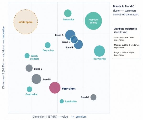
Standard perceptual map. Brands A, B and C sit on top of each other — whatever their positioning decks say, customers cannot tell them apart. The dashed circle is unclaimed territory, which is a hypothesis to test, not a recommendation.
Illustrative output. Same correspondence analysis, brands at centre and attributes on the rim.
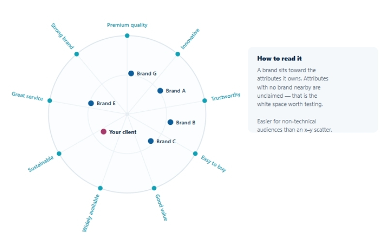
Moon plot — the same analysis, easier to present. Brands sit inside the circle and attributes around the rim, so attribute ownership reads directly. We deliver both.
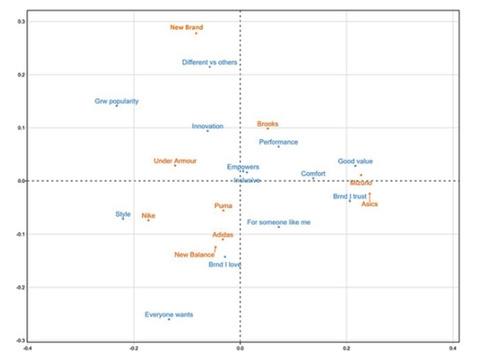
A real perceptual map from our work. This is the format your client receives.
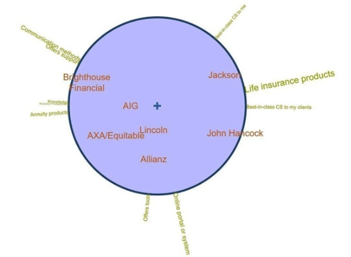
A real moon plot. Same data, arranged so non-technical stakeholders read attribute ownership at a glance.
Illustrative output. Importance weighting is what separates a real threat from a harmless weakness.
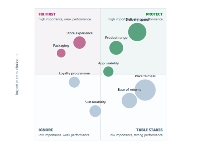
Performance–importance quadrants. Importance weighting turns a list of weaknesses into a priority order — a poor score on something nobody cares about is not a problem, and a good score on something everybody expects is not an advantage.
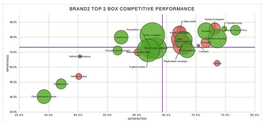
The competitive PI map as delivered. Strengths, threats and table stakes separated by importance, not by raw score.
Interactive tools
A static map answers the questions you anticipated. An interactive one answers the questions that come up in the room. Both tools below are browser-based or Excel, delivered as leave-behinds, and yours to demo under your own brand.
The map becomes something your client drives: filter to any subgroup and watch the positions move, add or remove competitors, switch attribute sets, and compare waves.
The importance overlay is what makes it more than a nicer chart. Attribute importance is rendered on the map itself, so a client can see at a glance whether the dimension they’re winning on is one that actually drives choice — or whether they’ve differentiated beautifully on something nobody cares about.
Turnaround 1–2 weeks
Price $2,000–$8,000 package
The PI quadrant packaged as a working tool rather than a static output. Your client changes the benchmark, the competitor set or the subgroup and the quadrant redraws — so the strengths, threats and table stakes are recalculated for whichever slice of the market they’re arguing about.
Turnaround 1–2 weeks
Price $2,000–$8,000 package
See attribute importance directly alongside brand positioning.
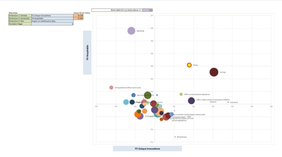
Interactive map with an importance overlay. The client filters, adds and removes brands, and reads position and attribute importance off one view.
Explore which potential changes could have the greatest impact on an outcome.
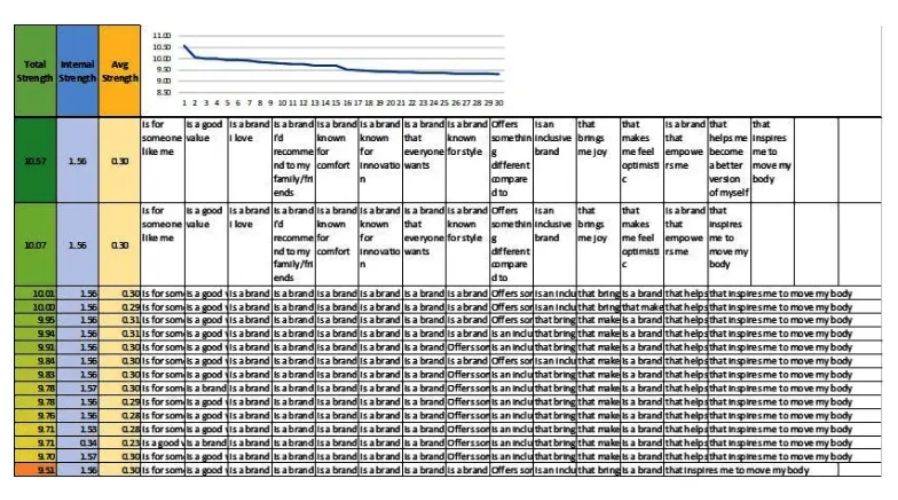
The mapping simulator. Browser-based or Excel, delivered as a leave-behind under your brand.
Combined simulator package
Interactive perceptual maps with importance overlays, competitive performance–importance charts, and Next Best Change can be built as one integrated simulator package rather than three separate tools — taking your client from “where do we sit,” to “what matters,” to “what should we change first” inside a single interface. 1–2 weeks, $2,000–$8,000.
Add-on module
The Interactive Profiling Tool can be built into any of these tools, letting your client define groups of interest on the fly and compare them instantly — without commissioning a new run each time the question changes. +1 week, $2,000–$4,000.
Different markets require different positioning dimensions. Some common starting points include:
The classic value-perception read, and the one where “we thought we were premium” most often surfaces.
Useful in categories where a heritage brand is being outflanked on modernity.
Separates aspiration from affordability when price alone doesn’t explain the positioning.
The standard software and device axis, where capability and simplicity trade against each other.
Increasingly decisive in CPG, automotive and household categories.
Derived from driver analysis on your own data — which is what we recommend when the budget allows. See Driver Maps.
These are common starting points, not fixed rules. The right dimensions should reflect how customers actually perceive and evaluate brands in your category. We can use research data and driver analysis to identify attributes that influence choice and inform the positioning dimensions.
Against
Failures
On sample size
Sample size should reflect the decision you need to make. Smaller samples may provide directional insight, while decision-grade maps typically require a larger, representative sample. If you plan to compare segments, the sample should also support the smallest segment you intend to analyze.
Maps show you where a brand sits. They don’t show you why, and they don’t tell you what change would improve the outcome. Those are different methods, and they combine well.
| QUESTION | METHOD | WHAT IT GIVES YOU |
|---|---|---|
| Where does our brand sit in customers’ minds? | Perceptual map / moon plot | Position, clusters, attribute ownership, white space |
| Which attributes are we exposed on? | Competitive PI charts | Importance-weighted strengths, threats and table stakes |
| Which change would move us most? | Next Best Change | Respondent-level simulation of impact |
| What causes the position we have? | Driver maps | Causal structure behind perception and outcomes |
| What would people choose, and at what price? | Choice modeling | Utilities, share of preference, price sensitivity |
Related reading: Using Perceptual Maps for Competitive Positioning and What Is a Perceptual Map?
Mistake 01
If the team chose the axes without customer input, the map measures what they care about, not what drives customer choice. Attributes come from the market, or the map is decorative.
Mistake 02
Letting the client's own people rate their own brand, or including respondents with no category experience, poisons the input. Perception is not awareness and not satisfaction.
Mistake 03
Perception shifts and competitors move. A map is a snapshot with roughly an eighteen-month shelf life — treat it as a fixed truth and the strategy built on it ages with it.
Takeaway
Most perceptual mapping studies don’t fail because of the visualization. They fail because the wrong attributes went in. The map is not the real point — the point is the decision.
We specialize in advanced brand positioning and market research analytics, helping research teams turn customer perception data into defensible positioning decisions.
We use driver analysis to establish which attributes actually influence choice before they become axes.
Standard map and moon plot delivered together, because they answer different halves of the question at no extra fieldwork cost.
Positioning connects to segmentation, driver maps and choice modeling — so the map leads somewhere instead of sitting on a shelf.
We won't tell your client an empty region is an opportunity until demand has been validated.
Brand positioning analysis examines how customers perceive a brand relative to competitors across relevant attributes. It can use perceptual maps, competitive performance and importance analysis, segmentation, and other analytical approaches to identify strengths, weaknesses, competitive differences, and potential positioning opportunities.
Positioning research helps businesses understand how customers perceive their brand and competitors, which attributes shape those perceptions, and where meaningful differences exist in the market. The findings can be used to evaluate competitive positioning and identify areas for further investigation or strategic action.
A product positioning map is a visual representation of how customers perceive products or brands relative to one another across selected dimensions. It can help reveal competitive clusters, similarities, differences, and potential gaps in the market. The map should be interpreted alongside the broader research rather than treated as proof of an opportunity.
The terms are used interchangeably in practice. “Perceptual” emphasizes how customers perceive brands; “positioning” emphasizes competitive placement. Same output, different emphasis.
Both come from the same correspondence analysis. The standard map is an x–y scatter where proximity means association. A moon plot places brands at the centre with attributes around the circumference, which makes attribute ownership much easier to read for non-technical audiences. We typically deliver both together.
Brand-by-attribute ratings from category-experienced buyers — semantic differential scales work well. Raw files in SPSS, Excel or CSV. Most brand trackers and U&A studies already carry a suitable battery; send us the questionnaire during design and we’ll review it free.
300–400+ representative category buyers for a decision-grade map. Below about 150 the map is a direction indicator, not evidence. Size to the smallest segment if you plan to present segment-level maps.
No — and this is the most common misreading. An unoccupied region may simply be a position nobody wants to buy from. We flag white space as a hypothesis to validate, usually with a choice model or concept test, rather than as a recommendation.
A map shows where you sit. PI charts weight each attribute by how much it matters, so you can separate real strengths from table stakes and genuine threats from irrelevant weaknesses. Turnaround is 4–5 days and they’re usually scoped alongside the map. Performance–importance also works against a non-competitive benchmark — a prior wave, an internal target or a category norm.
It renders attribute importance on the map itself rather than in a separate chart, so your client can see immediately whether the dimension they’re winning on is one that actually drives choice. It’s the difference between “we’re differentiated” and “we’re differentiated on something that matters.” Interactive builds run 1–2 weeks at $2,000–$8,000.
Yes. The interactive version lets your client switch the benchmark, the competitor set or the subgroup and watch the quadrants redraw, and adjust the importance threshold rather than accepting a fixed cut. Same 1–2 week, $2,000–$8,000 band as the interactive map, and the two are usually built together.
Yes — the Interactive Profiling Tool is a module that bolts into any map or simulator and lets your client define groups of interest on the fly and compare them instantly. It adds roughly one week and $2,000–$4,000.
Roughly every eighteen months in a stable category, sooner after a launch, a rebrand or a significant competitor move. Perception drifts, and a stale map quietly misdirects strategy.
Yes. Proposal language, one-pagers and example outputs, usually the same day you ask by phone or email.
Net-30, 50% at project start and 50% on delivery. Projects under $1,500 may be invoiced 100% on completion.
Every couple of months, receive insightful blog entries that use case studies, examples and demonstrations to show you how to get the most out of your advanced analytics and to see dangers you can avoid. This is a new series of posts that come directly from real experience happening right now!


